Muppets Most Wanted Poster (UK and Ireland)

Reevz1977

Well-Known Member
Joined
Jul 27, 2007
Messages
1,138
Reaction score
374
What I would have loved to have seen is this poster, but with as many Muppets as they could fit on, front and centre, running over the globe with Kermit right in the middle - or even keep the same idea of the 2 "Kermits" with them face to face and the rest of the Muppets running in the middle, with all many of characters posed as we've never seen them before.

Many people commented on the first poster for "The Muppets" that it was funny to see them walking. To see the gang all out running and animated in a zany and crazy way would have been very apt for the Muppets. Chickens and chaos everywhere.

The things I bother me about this poster are the very static nature of Piggy and Gonzo, Animals "Boo!!" pose, Kermits eye focus is too wide and the poser suffers all the problems we've grown to loathe with "fat face Kermit". I agree, its waaaaaaaaay better than the first and has a certain appeal. I just think it's poorly executed and I don't like the use of stock images to reinforce the "global" message of the movie that the globe already does sufficiently.

With regards to posters, did anyone notice the Muppet Show posters in the trailer?? From what I can see, that looks like a nice poster!!
 

Drtooth

Well-Known Member
Joined
Apr 16, 2002
Messages
31,718
Reaction score
6,707
I feel I have to say this, but this poster is better for not being loaded with Muppets, and having only the key characters. The thing that I really am starting to dislike about the American poster is the fact the characters are all jumbled together in a corner, segregated from the human co-stars. It's cool and all you get to see secondary, tertiary and whatever they call fourth level characters on a poster, but when it's all jumbled up it looks like those posters, puzzles, and calendars they used to photoshop extra characters that weren't there in old stock photos. or worse... that Sesame Street 40th anniversary book cover (why aren't we ever complaining about that? 's a million times worse).
 

LaRanaRene

Well-Known Member
Joined
Aug 2, 2013
Messages
302
Reaction score
319
The things I bother me about this poster are the very static nature of ...Kermits eye focus is too wide and the poser suffers all the problems we've grown to loathe with "fat face Kermit". I agree, its waaaaaaaaay better than the first and has a certain appeal. I just think it's poorly executed and I don't like the use of stock images to reinforce the "global" message of the movie that the globe already does sufficiently.

With regards to posters, did anyone notice the Muppet Show posters in the trailer?? From what I can see, that looks like a nice poster!!
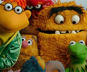
I like how Kermit's eye focus is. If you look at real frogs, their eyes are really like that. But I understand your opinion and I should not disagree, but i'm just pointing out that it makes Kermit look more like a frog.

Edited Costantine's mole out.... hee hee hee

Edited Costantine's mole out.... hee hee hee
http://prntscr.com/26gsv4
 

Reevz1977

Well-Known Member
Joined
Jul 27, 2007
Messages
1,138
Reaction score
374
I like how Kermit's eye focus is. If you look at real frogs, their eyes are really like that. But I understand your opinion and I should not disagree, but i'm just pointing out that it makes Kermit look more like a frog.
Hi, thats really is true, everyone is entitled to their opinion and whilst I have mine, I fully respect yours also :smile:

I'll be honest, I do take issue with the eye focus on a lot of the Muppets in the Disney era. The reason is that Jim Henson was VERY specific about the eyes, I think it was referred to as the "Henson Triangle", whereby he would almost make the eyes look cross-eyed so that the puppets appear to be focussed at a person or object. This really did work remarkably well. The worst offender in recent years is Fozzie who has a really glazed/spaced out look to him now that I personally find really off putting.

That said, there will be people out there who prefer that look - I guess it's just personal opinion.

Wow...sorry for the double post but that was just my 1000th :smile:
 

CaseytheMuppet

Well-Known Member
Joined
Dec 28, 2010
Messages
2,623
Reaction score
1,160
Could they have used better posers or new ones (though I don't think I've seen that Animal pose before)?
I think that is two different Animal pictures photoshopped together. The body appears to be from an old shot, while the head looks like one of their new posers.
 

jvcarroll

Well-Known Member
Joined
Mar 27, 2012
Messages
2,354
Reaction score
2,001
What I would have loved to have seen is this poster, but with as many Muppets as they could fit on, front and centre, running over the globe with Kermit right in the middle - or even keep the same idea of the 2 "Kermits" with them face to face and the rest of the Muppets running in the middle, with all many of characters posed as we've never seen them before.

Many people commented on the first poster for "The Muppets" that it was funny to see them walking. To see the gang all out running and animated in a zany and crazy way would have been very apt for the Muppets. Chickens and chaos everywhere.

The things I bother me about this poster are the very static nature of Piggy and Gonzo, Animals "Boo!!" pose, Kermits eye focus is too wide and the poser suffers all the problems we've grown to loathe with "fat face Kermit". I agree, its waaaaaaaaay better than the first and has a certain appeal. I just think it's poorly executed and I don't like the use of stock images to reinforce the "global" message of the movie that the globe already does sufficiently.

With regards to posters, did anyone notice the Muppet Show posters in the trailer?? From what I can see, that looks like a nice poster!!
Who knows? Maybe those better ideas are reserved for posters of the fine art variety. :embarrassed:
 

Mr Sweetums

Well-Known Member
Joined
Jan 14, 2013
Messages
145
Reaction score
134
I really like this poster, love the fact that it only has Muppets and no humans but I'm very surprised Walter didn't make it on the poster. :smile::fanatic::smile:
 

LaRanaRene

Well-Known Member
Joined
Aug 2, 2013
Messages
302
Reaction score
319
Hi, thats really is true, everyone is entitled to their opinion and whilst I have mine, I fully respect yours also :smile:

I'll be honest, I do take issue with the eye focus on a lot of the Muppets in the Disney era. The reason is that Jim Henson was VERY specific about the eyes, I think it was referred to as the "Henson Triangle", whereby he would almost make the eyes look cross-eyed so that the puppets appear to be focussed at a person or object. This really did work remarkably well. The worst offender in recent years is Fozzie who has a really glazed/spaced out look to him now that I personally find really off putting.

That said, there will be people out there who prefer that look - I guess it's just personal opinion.

Wow...sorry for the double post but that was just my 1000th :smile:
Yes, I do agree with Fozzie. He looks like he hasn't slept since 1992.
 

MuppetGuy75

Well-Known Member
Joined
Oct 9, 2011
Messages
199
Reaction score
127
I loosely collect movie posters and it always amazes me that the UK or Europe get the best designs compared to some of the posters I've seen here in the states. This one is another one that trumps the US version. Love it.
 
Top