The link didn't work and I think it's because Geocities doesn't let you directly link to images from another site (like a message board) To fix it, create a blank web page and post the image on that... then give us the link to the page instead of the image itself... that should fix it.
EDIT...
Okay I found a way around it... I went to your index page and manually typed in the jpg address... since I was coming from your site, geocities allowed me in to see the image...
If you don't mind, I have a few comments/tips...
First, let me say I liked the idea you were going for. It's definately in line with what Palisades has done in past desktops which is probably the biggest failing in my images... I tend to really distort the pictures to fit the image concept and while it might make a nice image, it's not much of a show off for the product line when it looks that funky...
You can check mine out at:
http://www.geocities.com/montyiv2001/index.html
I welcome any comments or criticism you have on my images as well... But enought about my stuff...
I did notice a few technical things which would have really helped your image pop. The first is the top curtain... it's kinda flat as it is now and you can see at several points, remnants of the white edge from when you cut and pasted it from the original image. A way around that is to increase the tolerance of the magic wand tool... (I'm making a rather large assumption that you used photoshop) The default tolerance of the magic wand is 32... increasing it will make it cut the image where you want it to without leaving those annoying off-color pixels. It takes a bit of trial and error but it's worth it in the end.
Also, the top curtain has no depth in relation to the other curtain. A great way to achieve depth is to add a drop shadow on whatever layer the top curtain is on. This seperates it and makes it look a little more 3-D, like it's casting a shadow on the other curtain.
I did like the cut-out effect with the figures but I wonder if you had anti-alias turned on as each one has a kind of a jagged edge. It's particularly noticeable in Floyd's cut out.
The only other thing I would suggest would have been to cut out the white background on the Jim Henson logo. Since the background is a very vibrant white, it's fairly easy to get rid of it and it allows you to mesh with the background a little more fluidly.
All in all though it's a great concept... Maybe you can revise it if they do another one for Series 3!
 Welcome to the Muppet Central Forum!
 Back to the Rock Season 2
 Sesame Street Season 54
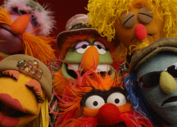 The Muppets Mayhem premieres
 Bear arrives on Disney+
 Sam and Friends Book
 and may take a while to download on a slow modem(much like mine)