Disney greenlights "The Muppet Show" comics

Status
Not open for further replies.

TheJimHensonHour

Well-Known Member
Joined
Dec 18, 2004
Messages
1,419
Reaction score
0
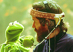
I think the Muppets look fine the only one who looks icky is Kermit which is not a good thing, poor Kerm he just can't catch a break these days.
 

frogboy4

Inactive Member
Joined
Apr 13, 2002
Messages
10,080
Reaction score
358
I have to admit that Rowlf, Janice and Floyd look pretty good here, but I don't really like the pig. Kermit just...man...this first comic is reportedly all about Kermit so it'll be pages of this stuff. I'm not thrilled about my personal fave Scooter in this piece either. It looks like Sweetums is there too, can't judge on that tiny image though. I'm most concerned about what he'll do to Gonzo. Recap of what we've seen from worst-best IMHO:
  • Kermit = F
  • Fozzie = D
  • Scooter = C
  • Piggy = C
  • Rowlf = B
  • Floyd = B
  • Janice = B+
 

RedPiggy

Well-Known Member
Joined
Apr 9, 2008
Messages
5,125
Reaction score
400
It's not completely ugly ... Vet's Hospital was better, though.

I think the reason a lot of the art of Kermit I've seen so far stems from this attempt to draw the many expressions of Kermit. You know how Kermit is ... he can't have a skull, as much as his head shape changes from one mood to the next. So, while it wasn't real pretty, I'd hardly say Kermit was the ugliest thing I ever saw (that honor goes to that drunk Fozzie-looking thing mentioned awhile back).
 

Fozzie Bear

Well-Known Member
Joined
Apr 14, 2002
Messages
13,372
Reaction score
148
Erm. Um. I--uh...

Yeah. It all looks like something from a Nickelodeon cartoon. Why does everything have to have someone's own 'twist' to it--why does it have to be so far stretched from what they should look like?

I did a Fozzie and Kermit drawing on my deviant art page not so long ago, and while it's in my style it isn't a huge stretch from what the characters look like. With all the photo and video reference that there are for the characters the likeness should be better.

But, the backstage and Vet's Hospital sets look right as drawn here!
 

frogboy4

Inactive Member
Joined
Apr 13, 2002
Messages
10,080
Reaction score
358
Erm. Um. I--uh...

Yeah. It all looks like something from a Nickelodeon cartoon. Why does everything have to have someone's own 'twist' to it--why does it have to be so far stretched from what they should look like?

I did a Fozzie and Kermit drawing on my deviant art page not so long ago, and while it's in my style it isn't a huge stretch from what the characters look like. With all the photo and video reference that there are for the characters the likeness should be better.

But, the backstage and Vet's Hospital sets look right as drawn here!
After voicing my criticisms I feel like saying a few of the good things. I agree that the sets, colors and composition look great here. It also appears the writing and themes are very vintage Muppet Show.

I still hope the artist revises Kermit and Fozzie. It's not like they are bit players. They don't all have to be gems (and I can even overlook what appear to be un-Muppety gray-colored rats) if the top billed cast looks better.

This comic originally was to be out this spring, but now has been pushed to next spring. I wonder if they're considering revisions?
 

frogboy4

Inactive Member
Joined
Apr 13, 2002
Messages
10,080
Reaction score
358
Let's hope so. This comic looks to be yet another in a long line of bad Muppet product.
Like this old thing from an archived Tough Pigs article? I think this Fozzie just saw the other cartoon drunk Fozzie and is frightened. I don't know which one is scarier?

I've said much about style and character design, but what ultimately seems to be missing is that distinct and effortless Muppet charm. It appears that charm has been replaced with smarm. The Muppets have really attractive designs already.

When creating from a master work an artist should reference the actual source rather than merely what they perceive it to be. A lot gets missed that way. I think there's been too much creative license given here. Somebody needs to rein it in. What I find troubling is that this artist is to also take over writing responsibilities in the future.

I hope they're retooling this a bit. I really do. I am also trying to locate a copy so that I might actually see this work up close.
 

Super Scooter

Well-Known Member
Joined
Dec 17, 2002
Messages
6,255
Reaction score
109
The style's okay. I think I kinda like it. But, isn't that Sweetums? Not Fozzie? It's really small on my monitor.

I'll get it. Kermit could use some (alot of?) work, but otherwise... it's... pretty good.
 

Super Scooter

Well-Known Member
Joined
Dec 17, 2002
Messages
6,255
Reaction score
109
That appears to be Sweetums. This is the Fozzie. :embarrassed: He gets worse. .
Oh, right, right, right. I got confused when I didn't notice anyone else post about Sweetums.

Can't say I care for that Fozzie. But, I like the rest of the comic enough to buy it. For the most part, the art is forgivable. I do wish they would stick to the actual design of the characters, though. :wink: Kermit and Fozzie... wow. That's kinda rough.
 
Status
Not open for further replies.
Top