Ok, wow some amazing stuff there and lots to comment on, suffice to say that our Kenneth has been keeping a lot under his hat lately (has enough room without the hair) so you kinda have to wonder what the heck they are gonna surprise us with for the rest of the year. I'd seen more or less all of these things at the UK Toy Fair in 2D face forward photo form but it's a whole different ballgame seeing them in 3D and from all angles - too cool !
Statler & Waldorf :- I really like them. The original pic i saw of Waldorf at the Uk fair had him a lot redder, maybe it was the lighting but i think the skin tones are great now. The look i think is very close to accurate although they do have kinda a comicy look to them. I liked the Vaudeville versions a lot too.
Beau :- The sculpt is perfect, i remember seeing the unpainted prototype picture and knew that then. There's something i don't like about the painted version - although the body is excellent i think the face looks a bit washed out, though it's been commented to me that you can't see the texture in the photo so maybe this isn't a problem on the actual figure. I'm impressed with his outfit - the colors and the wrinkles in his clothes etc.
B.O.P Fozzie :- I like him a lot - my only criticism would be that for an action figure, the paint contrast between the jacket and shirt isn't different enough - but then it's an accurate U.S cop uniform and changing it would change that, i can see this selling out fast and to a wider audience than just Muppet fans which is a great idea to get the line more recognition. It's going to be cool seeing all his accessories. I saw he is behind a plaque saying 'Exclusive' - no idea whether thats store or Toyfare.
Newsman :- I really like him, especially the paintwork and application. The height seems ok to me - perhaps a tiny bit too small but nothing to worry about. I like his glasses - thank god they didn't do crappy glasses like the Ned Flanders figures have. Once you see him with the accessories and stuff i bet you'll be blown away. He's one of the strongest figures for me.
Pepe The Prawn :- It helps to see him at an angle to appreciate him more, but my comments are pretty much the same as from the picture i saw at the UK Fair. I really like him and especially think they've done an excellent job on his hair. I do agree with people that there is something way 'off' with Pepe though i don't think it's the mouth being open - seeing that bit at a side angle i think helps it look better, posssibly it could be closed a tiny bit more. I think the problem is he does NOT have the Pepe expression - it's just a gaping stare. Maybe them sorting out the eyes will help, but i just think he's a very hard character to turn into an action figure. The thing about the actual Pepe puppet is that it looks better and more expressionate in close up 'TV' form than a drawing of a full body Pepe looks. Also on TV/Film, Pepes movements are quick, Bill uses movement to create the cheeky Pepe expressions and i'd bet it's nigh on impossible to recreate this with a figure. I also think, and have had reservations for a while that the blue hoodie wasn't the best outfit to have him in, though there wasn't much choice unless you aren't 'show accurate' - just doesn't work that well on a full body figure for me but it does look good and well designed overall. His scale looks great to me.
Janice :- I think the body is excellent - love the colors, love the short skirt, i like her tall and skinny. The detail and paint on the shoes and bangles is nice and i like what they've done with the belt. I agree with Jamie that the hat is making the figure look worse than it is - bad positioning there. I actually like the coloring of her hair. I do think maybe her eyes are a little too squinty. 'Boobage' is cool !
Gonzo & Camilla :- I absolutely adore this figure - it's the best representation of Gonzo ever. The suit is a lot redder than the purple shot i saw before so i guess thats changed. He looks better at an angle than the face forward shots that the CC saw. The facial look is right and the colors on the face/nose are perfect to me - i think they are totally right. I'm not too hot on Camilla seeing her like this - basically to me it's a generic muppet chicken and not Camilla. It looks great as a chicken, but the thing that set Camilla aside from the other muppet chickens was her expressions - this chicken is expressionless ! Maybe if they opened her beak a little more and gave her eyes more of a dilated, alarmed look it might be Camilla but i think we have an imposter chicken !

If the facotry put that shiny paint over Gonzo's fur then i'm going over there to kick butt - don't change a thing with him !
FM Piggy :- I think they've got her body just right, i have a problem with her face. It's better but it still isn't right. The hair is too yellow and theres something about the facial expression thats wrong. She's ok, and will look great in with the playset.
Sam Arrow :- I like him, the outfits great. Maybe the blue skin color is a little too dark. He looks massive. I like the detail on the feet - very cool. I think the Palisades photos looked better though.
Strangepork & Link :- They look good, not as good as the Palisades photos again. They lack something for me, but it's good that they are doing these brightly painted figures for the PIS playset as i think it needs it ..... comments to follow !
Swinetrek :- Most people like it, but i don't - i think it's dull and boring, not as bad as, but similar to the Muppet Labs. They've taken artistic liberties with the set to try to make it more varied, but they've kept the paintwork show accurate, just washed out dull grey and red which in my opinion is a big mistake. It'll look better when you have all the brightly colored figures in there but to sell, the piece will have to be attractive and work on it's own or just with Piggy placed in it. I like what they've done with the seats, especially the edges and detailed front, and if they can get the doors opening/closing it'll be a lot cooler but still to me, it's just a load of grey panellling with seats and it's low on interactivity, there's only so much you can do with endless buttons and levers. If they are bothering to break away from the set design then i don't see why they couldn't have introduced a few more original bits and spruced up the colors on the panelling a little bit, maybe a mix of that grey, red and a more metallic silver around the edges of panels and things. It's not THAT bad, but it's not a patch on the Swedish Chef's kitchen and i think they'll lose a lot of momentum because of that. Maybe it'll help that people should hopefully recognise it (a bit) but it's not gonna help impulse buyers if the other PIS figures have already sold out and left the shelves. I guess space/sci fi fans (and so a wider audience will like it). I dunno, i just think SO much more could have been done with this - i'm so not impressed !
Reporter Kermit & Koozebanians I really love this figure - it's a much better interpretation of Kermit than the regular one - he looks better wearing something and the detail and paint on the coat is excellent. Great look on his face too. Big climbdown on the Koozebanians - while i think it's better having them like this than a big playset i love em. They are all great looking and contrast well with Kermit, i also really like the idea of these mini playsets - excellent stuff.
Rizzo The Rat One of my favorite figures, i like the yellow regular version best. I'm probably in the minority of liking a larger Rizzo than a shorter one - more detail and makes for a better likeness but i guess theres a scale issue there anyway. The detail on him is very good, like him from the side better than the front but very good overall.
Bunsen & Beaker Tux :- Never got the point of all the Tuxedo figures till i saw Rowlf, but i quite like these guys in the tuxes too. Not a bad idea of Ken's - as a Tux collection i'm sure all these will look great.
Too Messed-Up Chef :- Nuff said about him, he looks better and worse than the Palisades photos. The face looks a tiny bit better in these shots, less mess on the face. Now though from this view it seems to have exploded onto the body - way too much. I'm sure the fans would have loved just a straight red repaint with some tiny little marks on the apron, (maybe a handprint - as someone suggested to me), a few specks of flour on his nose and moustache. This is exactly what it says it is - literally a catastrophe, hope Palisades sort it out. The lobsters don't do it for me either - i don't get whats so special about these three so-so looking lobsters that just sit there, it was ludicracy to spend a lot more money going to the trouble of ever sculpting these individually, what a waste. Still let the 30 or so hardcore fans have their little nods i guess, even if it does make a show figure more expensive and not any more likely to sell. *sigh*
Jim Henson Muppet :- Wow - very nice drawing. Pretty much accurate but there are probably some better reference photos around they could do with seeing - what a surprise. This shows Palisades really cares about the line and that they have gone out of their way to give fans what they want (as if we didnt know that with the lobsters). Great accessories - i'm sure everyone will hopefully have a chance to get one.
All in all some really lovely stuff !
 Welcome to the Muppet Central Forum!
 Sesame Street Classics on YouTube
 Sesame Street debuts on Netflix
 Back to the Rock Season 2
 Sam and Friends Book
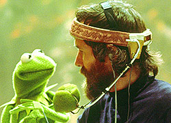 Jim Henson Idea Man
 Bear arrives on Disney+


